
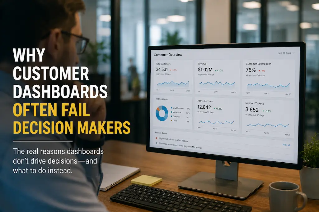
Companies expect customer dashboards to streamline decision-making processes and therefore invest significant time and money in their development. A well-designed dashboard centralizes sales performance, customer behavior, service metrics, marketing results, and operational data on a single platform. In theory, managers should be able to reliably determine resource allocation, improve the customer experience, or adjust business plans by viewing just a few pages.
However, many dashboards fail to meet expectations. Although managers often consult dashboards when making critical decisions, they still rely on meetings, spreadsheets, or intuition. Managers rarely use reports that teams have spent hours maintaining. Instead of serving as reliable business tools, dashboards often devolve into a collection of charts that describe events without explaining why they occurred or what needs to happen next.
The dashboard software itself is usually not the problem. Modern CRM (Customer Relationship Management) and business intelligence systems can process vast amounts of data. The real issue is that many dashboards are built around readily available data rather than business decisions. If a dashboard focuses too much on flashy charts rather than actionable insights, it leads to information overload instead of clarity.
To create dashboards that truly empower decision-makers, we must understand how leaders think, the questions they ask, and the steps they need to take. The most effective dashboards minimize uncertainty, highlight significant changes, and draw attention to risks and opportunities requiring swift action.
When Dashboards Become a Burden to the Business
Many companies believe that increasing the number of charts on a dashboard automatically increases its value. In reality, however, too much information is often counterproductive. Decision-makers have limited time and want dashboards to highlight the most important information. If every metric appears equally important, truly critical information is hard to spot.
Dashboards become a burden to the business when users spend more time analyzing data than actually using it. Because different stakeholders interpret the same data differently, this slows down discussions rather than accelerating decision-making. Meetings shift from resolving customer issues to interpreting reports.
Reporting Is Not the Same as Decision Support
It is a common misconception to view dashboards as reporting tools rather than decision-support systems.
Reports answer questions like “What happened last month?” whereas questions such as “What should we prioritize today?” require decision-support dashboards. Although both are data-driven, their objectives are fundamentally different.
For instance, displaying monthly customer acquisition data meets reporting requirements but does not really help a marketing director decide whether to increase ad spend, adjust marketing campaigns, or target different customer segments.
Dashboards that link performance metrics to business context are crucial for decision-makers. An effective dashboard should help identify where a drop occurred, which customer categories were affected, and what the potential causes are, rather than simply showing a decline in conversion rates.
The Hidden Reasons Decision Makers Stop Trusting Dashboards
Dashboard adoption rarely disappears overnight. Confidence usually declines gradually as users encounter information that feels incomplete, outdated, or disconnected from their daily responsibilities.
Understanding why trust erodes is essential before redesigning any customer dashboard.
Metrics Without Business Context
Numbers rarely tell the entire story.
Suppose a customer satisfaction score falls from 91% to 86%. At first glance, the decline appears concerning. However, without additional context, decision makers cannot determine whether the change represents a temporary fluctuation, a seasonal pattern, or a serious operational issue requiring immediate intervention.
Context transforms raw metrics into useful business intelligence.
Useful context may include:
- Historical performance trends
- Department ownership
- Recent operational changes
- Customer segment comparisons
- Industry benchmarks
- Related business events
When dashboards fail to provide this information, leaders often seek explanations elsewhere, reducing the dashboard’s role in decision-making.
Too Many KPIs Compete for Attention
Organizations frequently attempt to satisfy every department by placing dozens of performance indicators on a single dashboard.
Sales wants pipeline metrics.
Marketing wants campaign performance.
Customer support wants ticket statistics.
Finance wants revenue indicators.
Operations wants fulfillment efficiency.
Eventually, executives receive a dashboard containing fifty or more numbers, none of which clearly communicates where attention should be focused first.
Human attention naturally gravitates toward simplicity. When every metric appears equally important, users struggle to identify which issues deserve immediate action.
Instead of increasing transparency, excessive KPIs often reduce confidence because decision makers cannot distinguish routine fluctuations from significant business risks.
Visual Design Overshadows Business Value
Modern dashboard software offers countless visualization options, from animated charts to colorful gauges and interactive graphs. While these features can improve presentation, they cannot compensate for poor information architecture.
Many dashboards prioritize aesthetics over usability.
Common examples include:
- Multiple chart types representing similar information.
- Decorative graphics that consume valuable screen space.
- Inconsistent color meanings across pages.
- Excessive filtering options that overwhelm casual users.
- Charts requiring lengthy explanations during meetings.
An effective dashboard should allow experienced managers to understand business performance within minutes rather than requiring a guided tour every time they open it.
Information Arrives Too Late
Customer decisions often depend on timing.
If a dashboard updates only once every week while customer issues evolve daily, decision makers begin questioning whether the information still reflects current reality.
For instance, customer service managers monitoring complaint volumes may need hourly or daily visibility during a product launch. Receiving weekly summaries may delay corrective actions until customer dissatisfaction has already spread across multiple channels.
The appropriate refresh frequency depends on the business process rather than technical convenience.
| Business Function | Typical Decision Speed | Suitable Dashboard Update Frequency |
|---|---|---|
| Executive strategy | Weekly or monthly | Daily or weekly |
| Sales management | Daily | Near real-time or hourly |
| Customer support | Hourly | Real-time where practical |
| Marketing campaigns | Daily | Hourly or daily |
| Customer success | Daily | Daily |
Matching dashboard refresh cycles to operational decision cycles significantly increases usefulness.
Different Departments See Different Versions of Reality
Large organizations often maintain separate dashboards for sales, marketing, customer service, finance, and operations. Although each dashboard may accurately represent departmental performance, they frequently calculate shared metrics differently.
A marketing dashboard may count qualified leads one way while the CRM uses another definition. Sales reports may classify customers differently from customer support. Finance may calculate customer lifetime value using different assumptions than marketing.
These inconsistencies create confusion during leadership discussions because teams spend valuable time debating whose numbers are correct rather than identifying business improvements.
Strong dashboard governance establishes common metric definitions before visualization begins.
A Practical Decision Framework Before Building Any Customer Dashboard
Instead of asking, “What data should we display?” organizations achieve better outcomes by asking a different sequence of questions.
Start With the Decision
Every dashboard should support one or more important business decisions.
Examples include:
- Should customer success intervene with at-risk accounts?
- Which sales opportunities deserve immediate attention?
- Are customer service resources sufficient this week?
- Which marketing channels should receive additional investment?
- Which customer segments require retention efforts?
If a dashboard cannot clearly support a business decision, reconsider whether the information belongs there.
Identify Who Owns the Decision
Different users require different information.
A customer service supervisor focuses on response times and backlog trends, while a chief executive is more interested in customer retention, profitability, and strategic growth. Presenting identical dashboards to both users often satisfies neither.
Designing dashboards around user responsibilities ensures that every metric serves a meaningful purpose instead of existing simply because it is available.
Define the Action Behind Every Metric
Every KPI should naturally lead to a possible action.
Before including any metric, ask:
- What decision does this metric influence?
- Who is responsible for responding?
- What threshold requires action?
- What supporting information explains unusual changes?
Metrics without clear actions frequently become passive observations rather than drivers of business improvement.
Building Dashboards That Actually Improve Decisions
Once organizations understand why dashboards fail, the next challenge is designing dashboards that consistently support better decisions. This requires shifting the focus from displaying information to guiding action. Every screen should help someone answer an important business question quickly and confidently.
Prioritize Business Questions Before Metrics
Successful dashboards begin with questions rather than charts.
Instead of asking which KPIs are available, teams should identify the decisions leaders make every day. Examples include determining whether customer retention efforts are working, identifying declining service quality, or deciding where sales resources should be allocated.
Once these questions are defined, it becomes much easier to select the metrics that genuinely contribute to better decisions. This approach prevents unnecessary information from finding its way onto the dashboard simply because it exists within the CRM or reporting platform.
Organize Information by Priority
Not every metric deserves equal visibility.
Critical indicators that require immediate attention should appear first, while supporting information should be available without dominating the dashboard. Decision makers naturally scan dashboards from top to bottom, so placing the most important insights where they are immediately visible improves both speed and usability.
A practical structure often follows this order:
- Business health summary.
- High-priority alerts or risks.
- Performance trends.
- Supporting operational metrics.
- Detailed drill-down information.
This hierarchy reduces cognitive effort and directs attention toward issues that may require action.
Show Trends Instead of Isolated Numbers
Single values rarely tell a complete story.
For example, reporting that customer churn is 5% provides limited insight. Showing that churn has increased steadily over the last four months paints a much clearer picture and encourages investigation before the problem grows.
Trend analysis helps decision makers distinguish between temporary fluctuations and meaningful changes that deserve attention.
Comparison: Dashboards That Inform vs. Dashboards That Drive Decisions
| Traditional Dashboard | Decision-Focused Dashboard |
|---|---|
| Displays as many KPIs as possible | Displays only metrics tied to business decisions |
| Focuses on reporting historical data | Highlights current priorities and future risks |
| Requires meetings to explain charts | Can be understood quickly with minimal explanation |
| Every metric appears equally important | Critical issues are clearly prioritized |
| Measures activity | Measures business outcomes |
| Used occasionally | Becomes part of daily management routines |
| Static reports | Encourages action through context and recommendations |
Organizations that redesign dashboards around decision support often discover that fewer metrics produce better conversations and faster responses.
Common Mistakes That Undermine Customer Dashboards
Even well-intentioned dashboard projects encounter avoidable problems. Recognizing these mistakes early helps organizations build tools that remain valuable as the business evolves.
Measuring Everything Instead of What Matters
Collecting additional data is relatively easy. Determining which information deserves executive attention is much more difficult.
Many dashboards become crowded because every department requests additional metrics over time. Without periodic reviews, unnecessary indicators accumulate until important insights become difficult to identify.
Regularly removing metrics that no longer influence decisions keeps dashboards focused and manageable.
Ignoring User Feedback
Dashboard designers often assume they understand what executives need without validating those assumptions.
The people using dashboards every day usually recognize pain points long before developers or analysts do. Regular feedback sessions help identify confusing layouts, missing information, or metrics that rarely influence decisions.
Treating dashboards as evolving business tools rather than finished products significantly improves long-term adoption.
Inconsistent Metric Definitions
Organizations frequently struggle because different departments calculate customer metrics differently.
Examples include:
- Different definitions of active customers.
- Inconsistent sales pipeline stages.
- Varying customer lifetime value calculations.
- Different methods for measuring response times.
- Conflicting definitions of qualified leads.
Without standardized definitions, dashboards become sources of disagreement instead of trusted references.
Failing to Review Dashboard Relevance
Businesses change continuously.
New products launch, customer expectations evolve, markets shift, and organizational priorities change. Dashboards that remain unchanged for years gradually lose relevance because they continue measuring yesterday’s priorities.
Scheduling periodic reviews ensures dashboards evolve alongside business strategy.
Best Practices for Long-Term Dashboard Success
Organizations that consistently benefit from customer dashboards typically share several operational habits.
- Begin every dashboard project with clearly defined business decisions.
- Limit each dashboard to the information required by its intended audience.
- Use consistent terminology across departments.
- Review KPI relevance on a scheduled basis.
- Highlight exceptions rather than normal performance.
- Keep visual design clean and easy to interpret.
- Provide supporting context for significant changes.
- Validate dashboard accuracy before releasing updates.
- Encourage user feedback and continuous improvement.
- Measure whether dashboards actually improve decision speed and quality.
These practices transform dashboards from reporting tools into valuable components of daily business management.
Conclusion
Inadequate technology is rarely the reason customer dashboards fail. A common reason for their failure is that they are designed to present data rather than support decision-making. When dashboards prioritize data volume over relevance, attractive charts over clarity, and reporting over action, they become mere reference tools that offer no assistance in day-to-day management.
By building dashboards around actual business decisions, using consistent metric definitions, and presenting data in a way that highlights key points rather than overwhelming users with information, companies can improve their performance. Clear governance and thoughtful design complement each other, transforming dashboards into reliable tools rather than forgotten reports.
Ultimately, the customer dashboard with the most statistics or charts is not necessarily the most effective one. What truly makes a dashboard effective is its ability to help decision-makers quickly identify key developments, understand their impact on the business, and confidently take informed action.
Frequently Asked Questions
How many Key Performance Indicators (KPIs) should an executive dashboard contain?
Executive dashboards generally work better when focused on a small number of high-impact KPIs, though there is no standard rule. The goal is not to display all available information, but to support strategic decision-making.
Should all departments use dashboards?
Generally, no. Different roles entail different tasks. Dashboards should be tailored to the preferences of each target audience, while maintaining a consistent underlying business definition.
How often should customer dashboards be updated?
The update frequency should align with the pace of business decisions. A senior planning dashboard might only require daily or weekly updates, whereas customer service teams need near real-time information.
Does excessive automation reduce dashboard effectiveness?
Automation can improve efficiency but often adds unnecessary complexity by automatically displaying every available metric. Automation should not lead to information overload; instead, it should help uncover relevant insights.
Why do executives sometimes prefer spreadsheets over dashboards?
Spreadsheets often offer an analytical flexibility that poorly designed dashboards lack. When dashboards fail to provide actionable business answers, users instinctively turn to tools that allow them to delve deeper into the issue.
How can companies evaluate dashboard effectiveness?
Evaluating success should focus on business outcomes, not just usage rates. Faster decision-making, shorter response times, higher adoption rates, fewer reporting discrepancies, and measurable improvements in customer-facing performance are all useful metrics.