
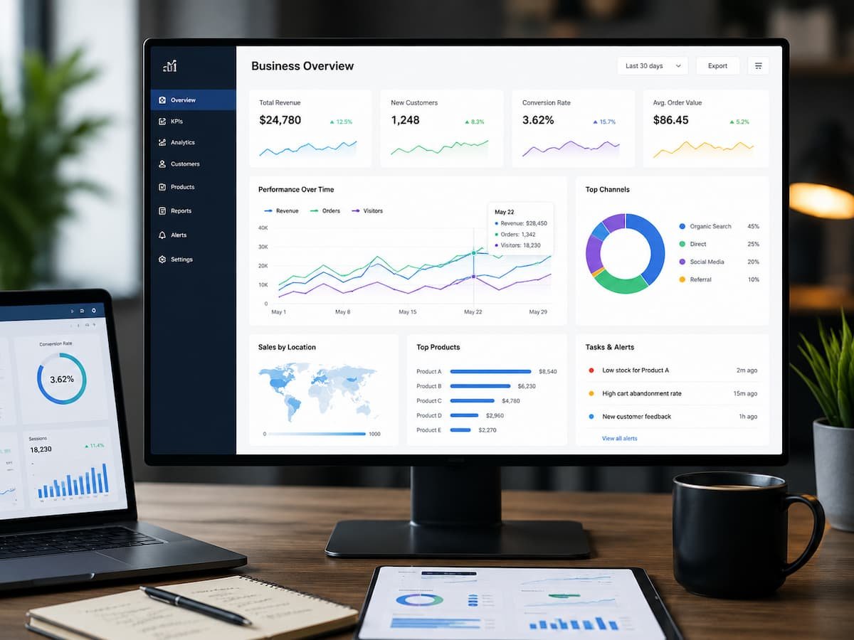
Dashboards are now ubiquitous in most organisations. Sales teams evaluate sales channels, customer service managers assess responses, marketers evaluate campaigns, and executives review revenue figures. Despite the vast array of dashboards available, many critical decisions are still made by interpreting dashboard content alongside spreadsheets, email summaries, or lengthy meetings. This is not because dashboards lack importance, but because many are designed to solve a technical problem—”What data can we display?”—rather than a business problem—” What actions should we take?”
A useful dashboard is more than just neatly presented data. It helps people identify key issues, understand their significance, and determine action plans without having to consult multiple reports. Dashboards are no longer tools viewed only occasionally; they have become part of daily decision-making because they eliminate uncertainty and shorten the path from observation to action. Understanding users, their decisions, and the context is crucial for designing dashboards that can continuously drive business operations. While attractive charts can enhance presentation, clarity, relevance, and ease of use determine whether a dashboard serves as an operational tool or merely a reporting tool.
Why Some Dashboards Are Opened Every Morning While Others Are Forgotten
Many dashboards attract significant attention when they first go live. Teams spend weeks selecting key performance indicators (KPIs), visualising data, and integrating data sources. In the weeks following a new dashboard’s launch, everyone is enthusiastic about the new reporting environment, resulting in high usage rates. Over time, however, usage trends reveal a significant difference. Some dashboards help employees prioritise tasks and respond quickly to changing situations, and they become part of their daily routine. Others become less useful because they rarely influence decision-making; while they may still be consulted before management meetings, they are mostly excluded from day-to-day operations.
The technology itself rarely plays a decisive role. What matters is whether the dashboard actually solves business problems in practice. Customer success managers want to know from the start which customers require priority, not just how many customers are in the CRM system. Sales directors do not analyse every single opportunity; instead, they aim to identify problems. When dashboards support these goals, they become vital operational tools.
Start With the Decision, Not the Dashboard
One of the biggest design mistakes happens before anyone creates a single chart. Many dashboard projects start by listing available reports, selecting visualisations, and arranging charts on a screen. Although this approach produces attractive layouts, it often overlooks the most important consideration: the decisions users need to make. A more effective approach begins by identifying the situations in which people depend on information.
Questions such as these provide a stronger design foundation:
- Which customers require immediate follow-up?
- Where is the sales process slowing down?
- Which service issues are becoming recurring problems?
- Are customer retention initiatives producing measurable improvements?
- Which business trend requires management attention today?
Once these questions are clear, selecting appropriate metrics becomes significantly easier because every element supports a specific purpose.
A Dashboard Should Reduce Decisions, Not Create More
Poorly designed dashboards often present so much information that users become uncertain about what deserves attention first. Imagine opening a dashboard with thirty charts, multiple filters, colour-coded indicators, and several pages of KPIs. Although comprehensive, the experience often leaves users wondering where they should begin.
An effective dashboard narrows the decision space. Instead of asking users to interpret everything, it guides them toward the few issues that are likely to influence business performance. This approach reduces analysis time while improving confidence in decision-making.
Design Around Roles Instead of Departments
Organisations frequently create dashboards for departments such as Sales, Marketing, Customer Service, and Finance. While departmental organisation appears logical, it does not always reflect how people actually perform their work. People with different responsibilities inside the same department often require entirely different information.
Different Responsibilities Require Different Views
A sales representative typically needs visibility into assigned opportunities, upcoming activities, and customer interactions. A sales manager focuses on pipeline health, forecast accuracy, coaching opportunities, and team performance. An executive is more concerned with revenue trends, customer acquisition costs, and long-term business growth. Attempting to satisfy all three audiences with one dashboard usually produces unnecessary complexity. Each user spends time filtering information that is irrelevant to their responsibilities. Designing dashboards around user roles rather than organisational departments creates more focused experiences and improves adoption.
Keep Important Information Immediately Visible
Users should not have to search through multiple pages to locate information that directly affects their daily work. High-priority items deserve immediate visibility. Lower-priority supporting information can remain accessible through drill-down reports without distracting from primary decision-making. This principle applies whether the dashboard contains five metrics or fifty. Visibility should reflect business importance rather than data availability.
Information Hierarchy Matters More Than Visual Effects
Modern dashboard platforms offer impressive visualisation capabilities. Interactive maps, animated charts, custom colour palettes, and advanced filtering options can all enhance presentations when used thoughtfully. However, visual sophistication should never replace clear information hierarchy. Users naturally scan dashboards within seconds of opening them. They identify large numbers, highlighted alerts, trend indicators, and visual patterns before reading detailed labels or explanations. Designers should use this behaviour deliberately.
The most important business information should appear where users naturally look first. Supporting details can appear later, allowing readers to move from summary to detail without becoming overwhelmed. An organised hierarchy also improves consistency. When dashboards follow predictable layouts, users spend less time learning where to find information and more time interpreting business performance.
Make Trends More Visible Than Individual Numbers
A single KPI rarely explains whether performance is improving or declining. For example, displaying a customer satisfaction score of 88 per cent provides useful information, but it offers limited perspective. Is that score improving? Has it remained stable for six months? Is it significantly lower than expected?
Trend information answers these questions far more effectively than isolated values. Showing how important metrics change over time allows managers to distinguish temporary fluctuations from meaningful business shifts. It also encourages proactive decision-making because gradual declines become visible before they develop into larger operational problems. Whenever possible, dashboards should emphasise movement rather than simply reporting current status.
Dashboards Should Encourage Investigation, Not Replace It
No dashboard can answer every business question. Instead of attempting to display every available metric, effective dashboards provide a clear starting point for more profound analysis when necessary. Suppose a dashboard highlights declining customer retention among enterprise accounts.
Rather than filling the screen with every possible supporting metric, it should make it easy for managers to explore related information such as customer engagement history, support activity, renewal timelines, or account ownership. This layered approach keeps dashboards uncluttered while ensuring users can investigate important findings without switching between disconnected reporting systems.
Context Turns Information Into Better Decisions
Even the most carefully designed dashboard can become misleading when important context is missing. Imagine a customer support dashboard showing that average response times increased during the previous week. Without additional information, managers may conclude that service performance has declined. However, if the organisation experienced an unexpected surge in support requests following a successful product launch, the increase may reflect higher customer demand rather than operational inefficiency.
Providing context helps users interpret information correctly. Simple additions such as comparison periods, performance targets, recent business events, or historical averages often improve understanding far more than adding additional charts. Instead of asking users to guess why a metric changed, the dashboard provides enough background to support a more informed decision.
Alerts Should Highlight Exceptions, Not Everything
Some dashboards try to attract attention by highlighting dozens of metrics with colours, warning icons, and notifications. When every KPI appears urgent, users eventually stop paying attention to the alerts altogether. Effective dashboards reserve alerts for situations that genuinely require action.
For example, a customer success dashboard might notify managers only when a high-value account shows declining product usage combined with unresolved support issues. A sales dashboard may highlight opportunities that have remained inactive beyond an acceptable period, rather than flagging every opportunity equally. This selective approach helps users focus their attention where it creates the greatest business value.
Avoid Measuring Activity Instead of Outcomes
Many dashboards emphasise how busy teams are rather than whether they are making meaningful progress. Tracking the number of emails sent, calls completed, or meetings scheduled may provide operational visibility, but these activities do not necessarily indicate business success. Whenever possible, dashboards should balance operational activity with outcome-orientated measures such as customer retention, successful renewals, sales conversion, or customer satisfaction. This approach encourages decisions that improve business performance rather than simply increasing workload.
Comparing Dashboard Design Approaches
The way information is organised has a direct impact on how effectively people respond to changing business conditions.
| Dashboard Designed for Display | Dashboard Designed for Action |
|---|---|
| Shows as much information as possible | Prioritizes the most important business decisions |
| Every metric receives similar attention | Critical indicators stand out immediately |
| Users search for meaningful information | Dashboard guides users toward priorities |
| Focuses mainly on historical reporting | Encourages timely operational responses |
| Static presentation of KPIs | Supports investigation through drill-down analysis |
| Measures activity alone | Balances activity with business outcomes |
This comparison illustrates that successful dashboards simplify decision-making rather than increasing the amount of information users must interpret.
Encouraging Consistent Dashboard Adoption
Even an excellent dashboard provides little value if employees seldom use it. Adoption improves when dashboards naturally fit existing workflows instead of requiring users to change the way they work. Managers should be able to begin meetings using dashboard insights, sales teams should access relevant information before customer conversations, and customer success specialists should quickly identify accounts needing attention during daily reviews.
Training also plays an important role. Employees should understand not only where to find information but also how each metric supports business decisions. When users recognise the practical value of dashboard elements, they are more likely to rely on them consistently. Organisations should also collect feedback after deployment. Regular users often identify unnecessary metrics, confusing layouts, or additional context that would improve usability. Treating dashboards as evolving business tools rather than finished projects keeps them aligned with changing operational needs.
Evaluating Whether a Dashboard Is Actually Working
You cannot measure dashboard success solely by visual design or technical performance. A more meaningful evaluation considers how effectively the dashboard supports decision-making.
Questions worth asking include:
- Are users identifying issues earlier than before?
- Do meetings spend less time explaining reports and more time discussing actions?
- Has confidence in reporting increased across departments?
- Are operational decisions being made more quickly?
- Do users access the dashboard regularly without being reminded?
Positive answers suggest the dashboard is becoming part of everyday business operations instead of serving as a passive reporting interface.
Conclusion
The mind shift you need is to build dashboards that lead to better actions. Instead of asking how much information can be displayed, organisations should be asking, ‘How can we help users identify priorities, grasp the business context, and make confident decisions?’ And a dashboard works when it helps users move from knowing there’s a problem to taking action.
The best dashboards are developed for their users, not for the reporting software. Organisations that emphasise clear information hierarchy, role-based design, meaningful trends, focused alerts, and accurate context produce reporting environments that drive consistent use and sound decision-making.
A dashboard isn’t valuable just because it has data on it. They become valuable when they allow people to respond faster, cooperate more effectively and make decisions that build customer relationships and foster sustainable corporate growth.
FAQs
1. What is the main use of a company dashboard?
A company dashboard must show the most relevant information needed to make fast and educated decisions. It’s not only about presenting facts but also helping users identify priorities and decide what to do.”
2. Does every employee need to use the same dashboard?
Not normally. Roles need distinct types of information. Organisations need to standardise business terminology, but dashboards are often most effective when tailored to the roles and decisions of different user groups.
3. How many KPIs should be on a dashboard?
That number is not fixed, but the dashboard should stay focused on the indicators that directly support user decisions. Too many KPIs usually mean less clarity and less visibility of critical information.
4. Why do trend indicators matter?
Trends provide context for whether performance is trending up, down or sideways over time. They allow managers to find problems that are growing and may not be visible in the individual values.
5. How often should you revisit your dashboard designs?
Dashboard layouts should be revised often, particularly when business priorities, reporting requirements or user roles change. Regular user feedback also helps keep dashboards useful and relevant.
6. Is a dashboard or a detailed business report better?
Dashboards give you high-level visibility so you can see where attention is needed. Detailed reports are still useful for deeper analysis, research and strategic planning. The two should complement, not compete with each other.